Tealium’s Design System
My Role
Team Lead
Senior Designer
The Team
Myself
Director of Front-End Engineering
Senior Developer
Junior Designer
Duration
1+ Year
Overview
Tealium’s product is a CDP (customer data platform) that connects customer data across web, mobile, offline, and IoT, helping businesses understand and connect with their customers. Tealium’s enterprise application includes machine learning, tag management, an API hub, and data management solutions that allow users to analyze their customer data to make more valuable decisions about their business and advertising, while keeping the customer information privacy-compliant and secure.
Basically? It’s a big enterprise application with a ton of data that users (multiple users for each client!) need to manage and manipulate in multiple ways, and it has privacy concerns to boot because it’s dealing with customer’s personally identifiable information.
Problem
When I joined Tealium, they knew they needed a design system to get a handle on their ever expanding enterprise application and were far enough in the process to know they wanted to base it on Material Design (at least, from the development side of things), but they were not sure how to get all of their designers on board. The previous system and documentation was not very extensive, and when they tried to implement it, it hadn’t been widely adopted by everyone. Designers would frequently detach components to make changes necessary for their work.
My goal as the design system lead was to create a system that everyone would actually reference and use.
I was also the person on the team in a position to look at the application from a place outside of a project team, and that enabled me to catch and correct the user experience inconsistencies that had been making onboarding and implementation more difficult. These more consistent UX patterns were also documented as part of the design system.
Research
I started with an audit of the current state of any components Tealium had and how they were being used, as well as investigating the usability of their existing UI. They had some existing components and patterns documented, but they weren’t user friendly for designers and the states designed for didn’t match up with the Material Design UI kit that the development team wanted to use for implementation. The file was poorly organized and difficult to navigate, and there was very little documentation or annotations for any element. There was a lot of opportunity for improvement available in the Figma file setup alone.

Original buttons used by Tealium.
I spoke with executives at the company about what their goals for Tealium’s product were, and heard overwhelmingly that users told them the app was “hard to learn” and “too complicated”. Both common complaints with enterprise applications.
Getting Started
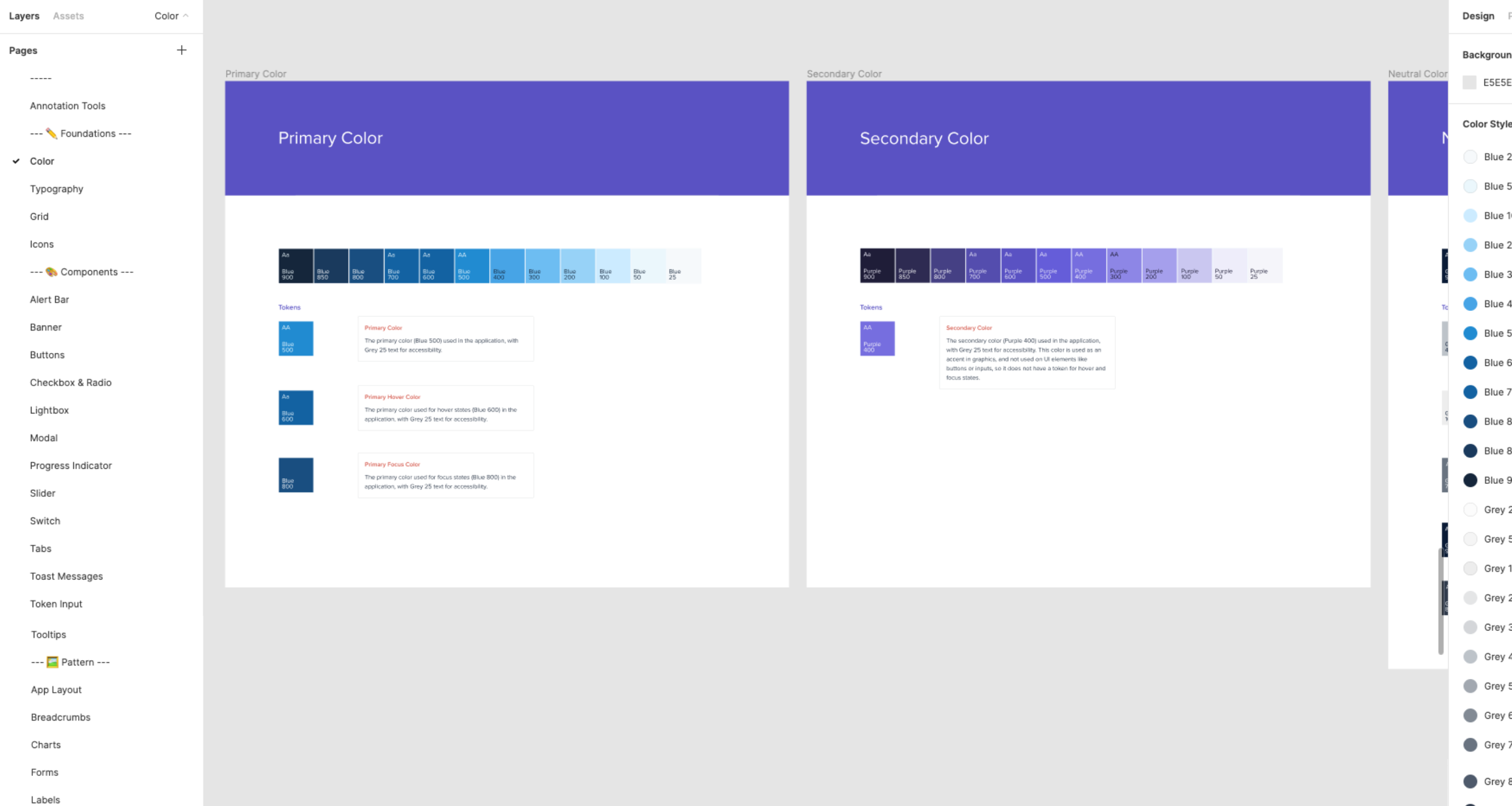
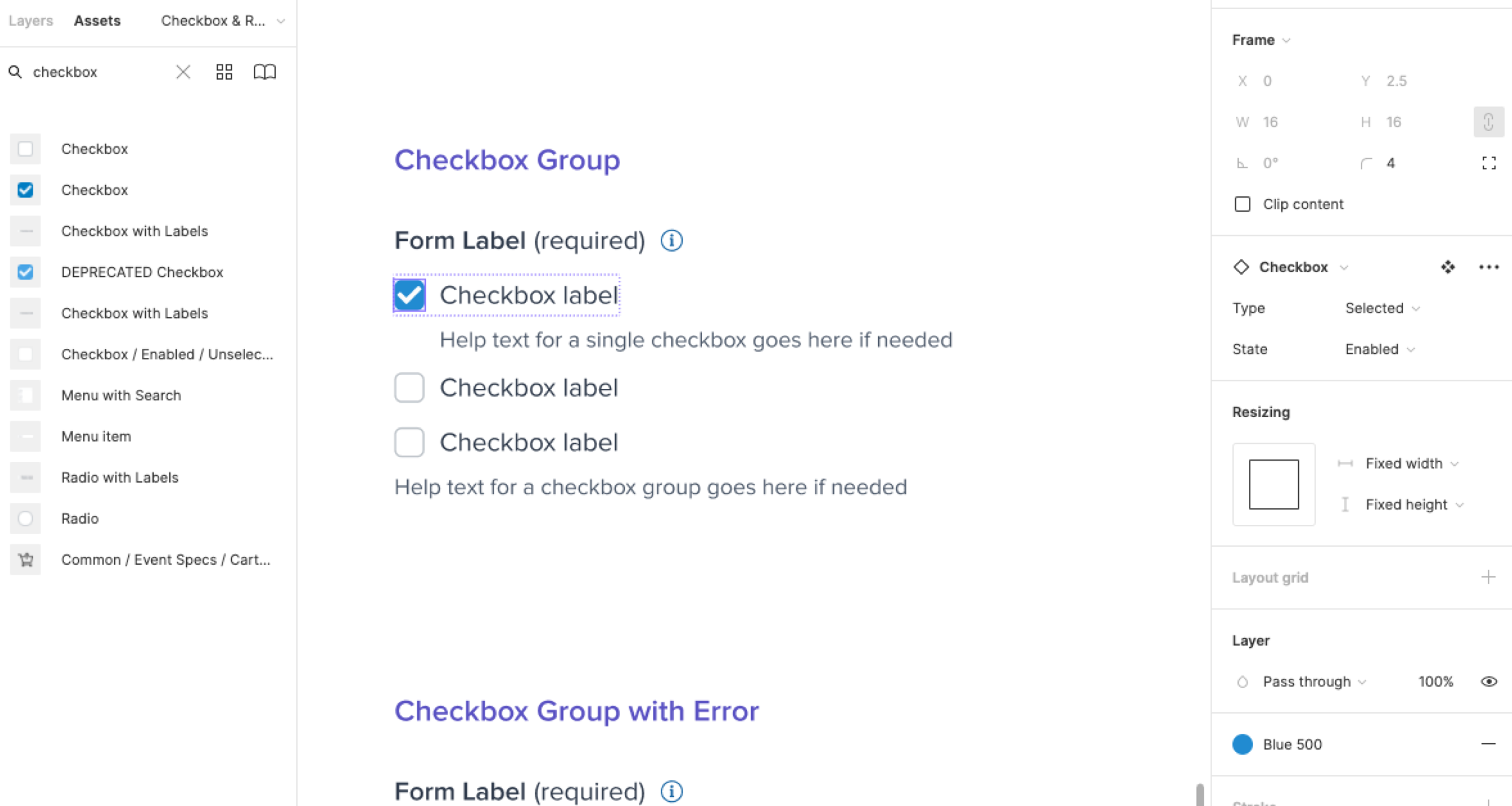
My first step in tackling that complaint was changing the grid that designs were based on from 4px to 8px, to add white space and allow for more room to place elements on the page, and from there I started tackling how to make all the components and interaction patterns in the application more consistent. Every component needed to be remade to create variants in Figma (a new feature at the time) and also to update how icons were being used to something more sustainable long-term.
Providing not only consistent UI elements, but also consistent interaction behaviors, is the key to making large enterprise applications feel “less complicated” for both new and experienced users.
Figma File Improvements
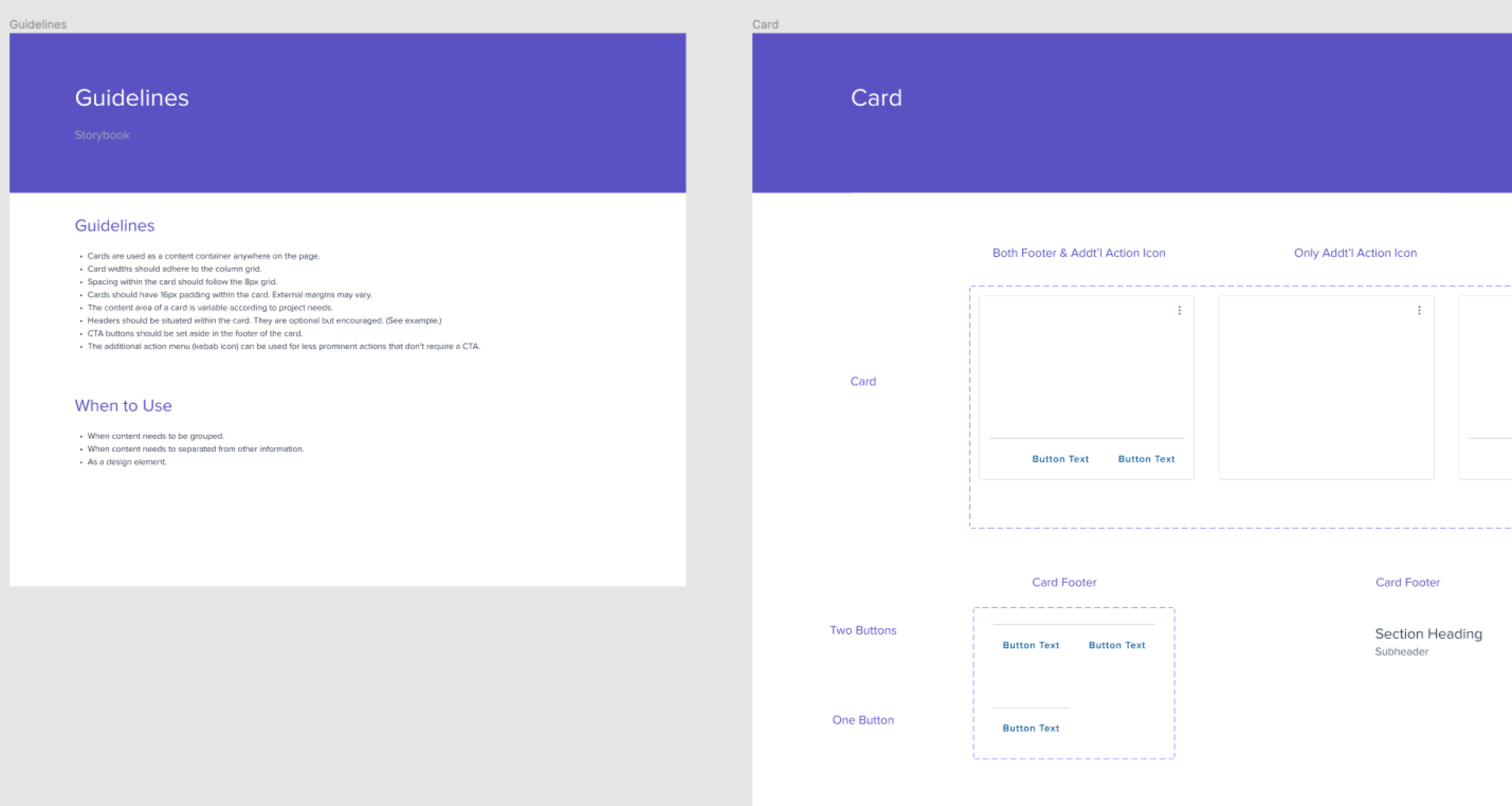
I started off by creating a new design system file, so that both the old and new file could co-exist for a time and help ease the transition. Another big change was the organization and documentation provided by this file. I believe that having an easy to navigate file makes all the difference in helping a design team adopt the system and use it with ease.
I organized the file into Foundations, Components, and Patterns (as well as a Works in Progress section for anything not finalized.) Each page then had clearly named frames and annotations (components to use for annotating work were also part of the design system, part of a separate effort I undertook to ensure consistency in file handoff—ask me about that sometime!)
All components were made as variants that accounted for every state (default, hover, error, etc.) Having well organized components allowed designers to search for elements in the assets panel and easily place them in any design project file, and they were then able to adjust the components to match what they needed using the parameters available on each variant.
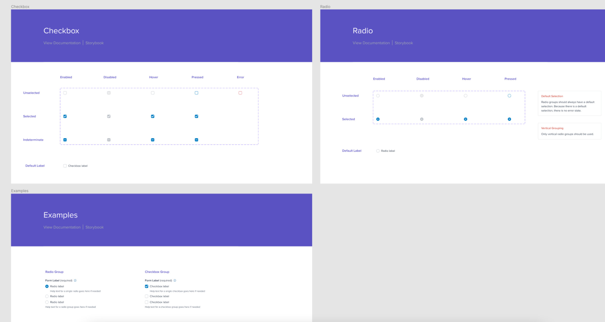
Interaction Pattern Updates
The thing that really starts to make a design system useful for solving problems is having common interaction patterns defined, documented, and able to be reused or iterated upon easily.
This was one of my main goals when building out Tealium’s design system. With a large enterprise application, the best way to help that “complicated, hard to use” feeling that users experience is to simplify the ways that common tasks are completed. This can be difficult on both small and large design teams when designers are siloed onto feature teams and don’t have insight into every small problem being solved.
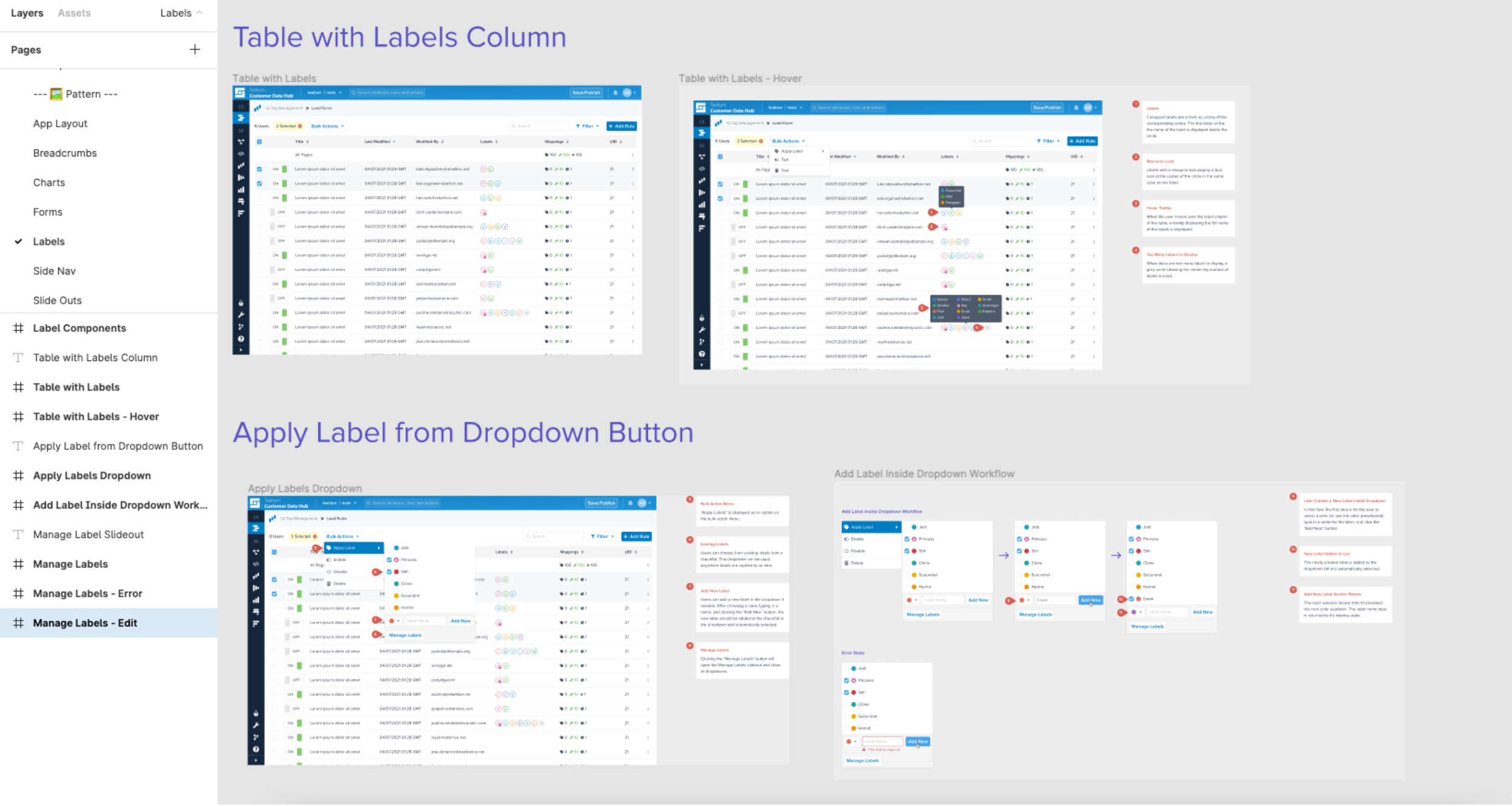
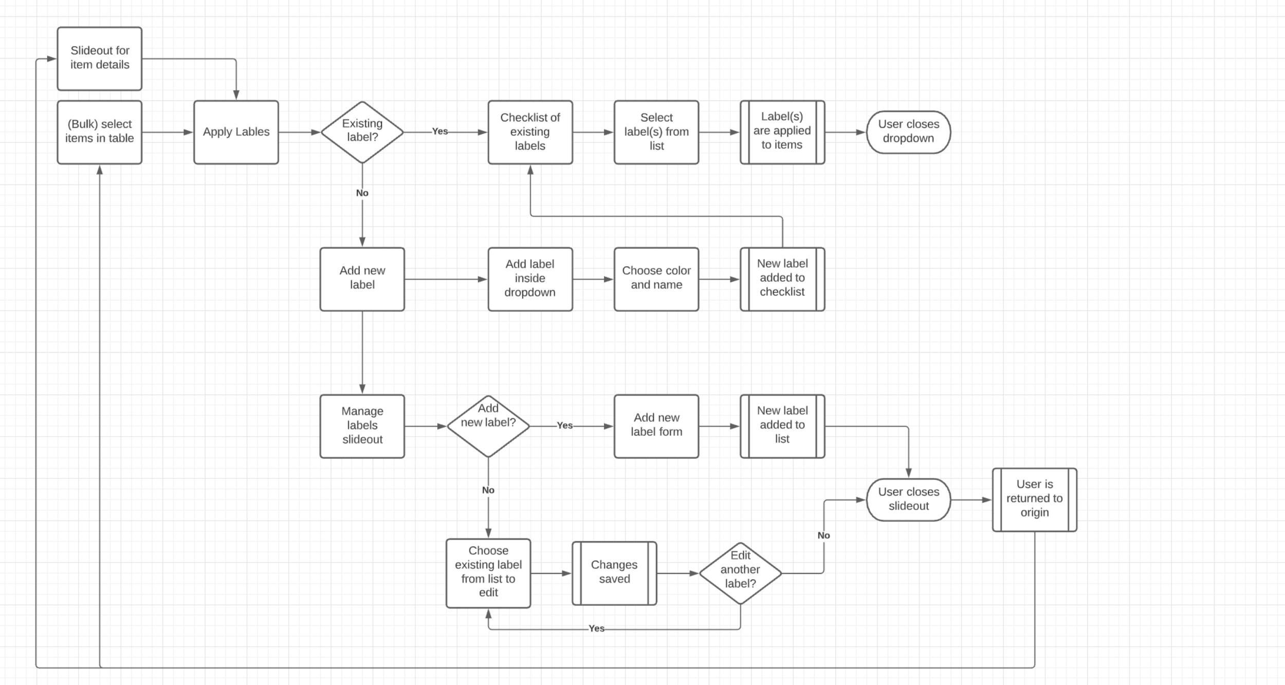
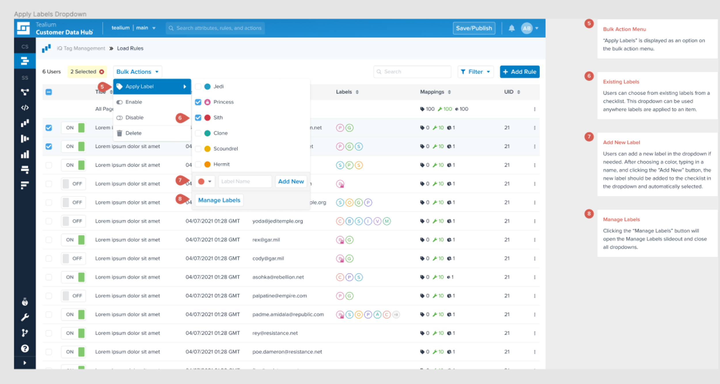
One example was the interaction pattern for adding a label to an item in the application. This was something that users did frequently across different features of the application, but each feature was handling it differently. When the features were built, years ago, the user bases were separate and at the time it did not seem like an issue that the problem was solved in different ways. But now, the user base was the same, and the competing solutions were making the app feel “complex” and “hard to use”.
I created a new workflow for how to assign labels to an item, and then design the wireframes and high-fidelity mockups that would be needed for development of the feature. These were documented in the design system as a pattern that was used across the entire application.
Having common interactions like this solved in the design system frees up designers to solve the unique problems that arise on projects and features, instead of spending time on problems that were already solved somewhere else.
Documentation
Documentation is one of the most important aspects of setting up a design system, otherwise the people trying to use it won’t know what the intended use of anything they’re looking at is supposed to be. I included nearly all of the documentation for Tealium’s design system in the Figma file. Storybook was used for components and patterns that had been completed in development, and a link to the components in Storybook was included in the Figma file for reference. Designers on the team spent all of their time in Figma, so having the documentation right there made sense for their team.
Process
A large part of my role as design system lead was also as an advisor. I was in a unique position where I wasn’t siloed on a feature team, so I was able to have more insight into what was happening on all the projects, and was able to advise other designers on how they could ensure consistency in their solutions with not just the existing application, but also with work that was currently in progress on other projects.
I conducted design system reviews with product teams during both early and late phases of design work to give guidance on interaction patterns and component usage. I also held weekly office hour meetings to provide a collaborative time for designers to bring up questions about the design system and brainstorm on solutions.
I also worked with partners in the engineering organization to institute several process improvements in how requests for new components were handled on not just the design team, but also the development team.
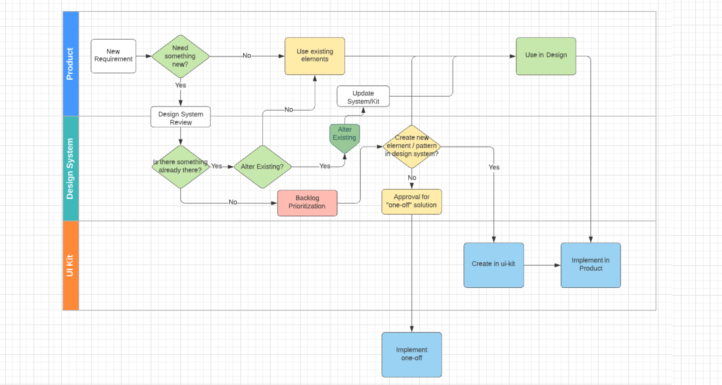
Workflow for choosing or requesting a new component.
Outcome
After a little over a year spent working on Tealium's design system, I'm proud to say that the system was in a place where all designers and developers were using it daily. The design system was in use across the entire application. The processes implemented for making decisions on which components to use, and for when to use an existing component or to submit requests for modifications or new components, were being followed. The team had added a junior designer who I'd been working with closely on how to grow the system's documentation.