Charles Schwab
My Role
Senior Designer
The Team
Myself
Product Owner
Copywriter
UX Researcher (3rd party company)
Duration
12+ months
(6 months per project)
Overview
Charles Schwab offers brokerage, banking, and financial advisory services to customers. As a Senior UX Designer at Schwab, I worked on features used by brokerage clients to view and manage their accounts. My role encompassed everything from initial requirements gathering, journey mapping, UX design, prototyping, and assisting with user research sessions, to working with content writers and assisting development teams with any design issues encountered during production. I worked closely with teams spread across the country, as well as engaged with outside venders.
I’ve highlighted two projects here: an addition to the homepage for investment income, and a redesign of how beneficiaries were managed.
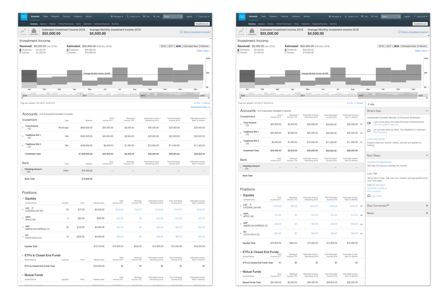
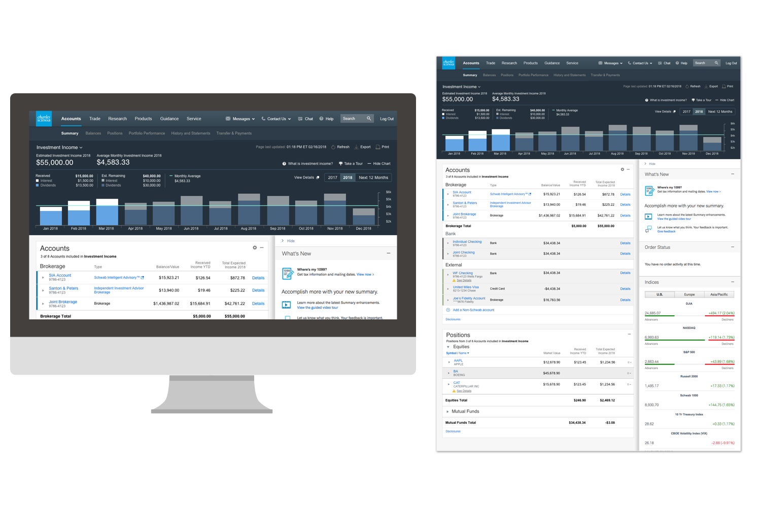
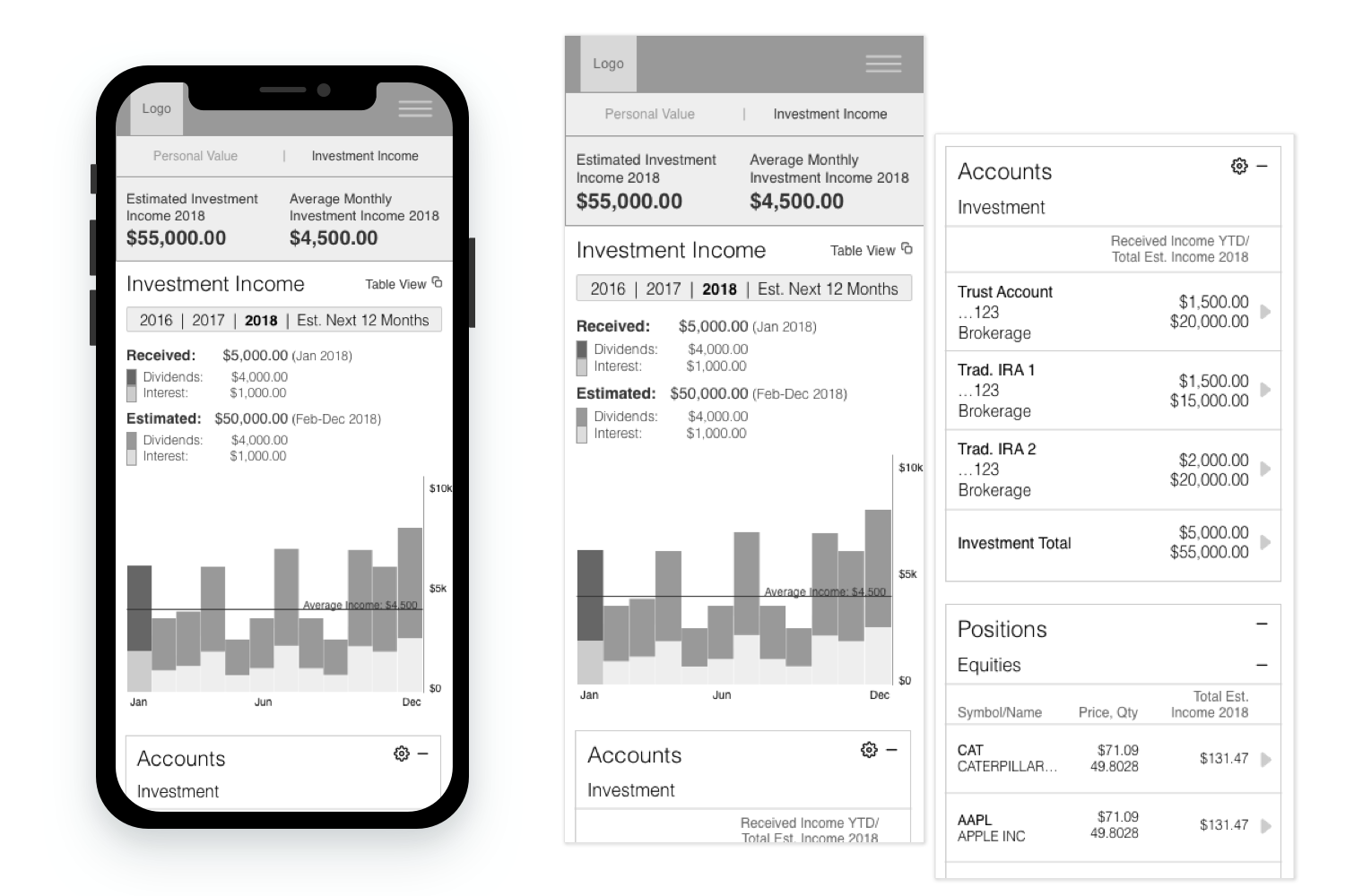
Investment Income
Problem
The homepage (or Account Summary page) for Schwab only showed users the total amount in their investments accounts, a number Schwab called their “Personal Value”. However, the charts and tables on the Account Summary page did not account for investment income that users would need to live off of in retirement, and retired clients were a large and ever-growing segment of Schwab’s client-base, and one that they wanted to cater to.
Getting Started
I came on during the early phases of this project; the product owners knew what types of data they wanted to display and that the design needed to fit in with the current Account Summary homepage, but otherwise the project was an open canvas. I tackled the chart design first, testing both an area chart and a bar chart with users to see which was easier to read. I tested multiple versions of the tables on the page, to find out which columns of data were most important to users, and which could be hidden in the smaller sidebar and mobile views.

Sketches of different chart styles that were tested.
Wireframes & Mockups
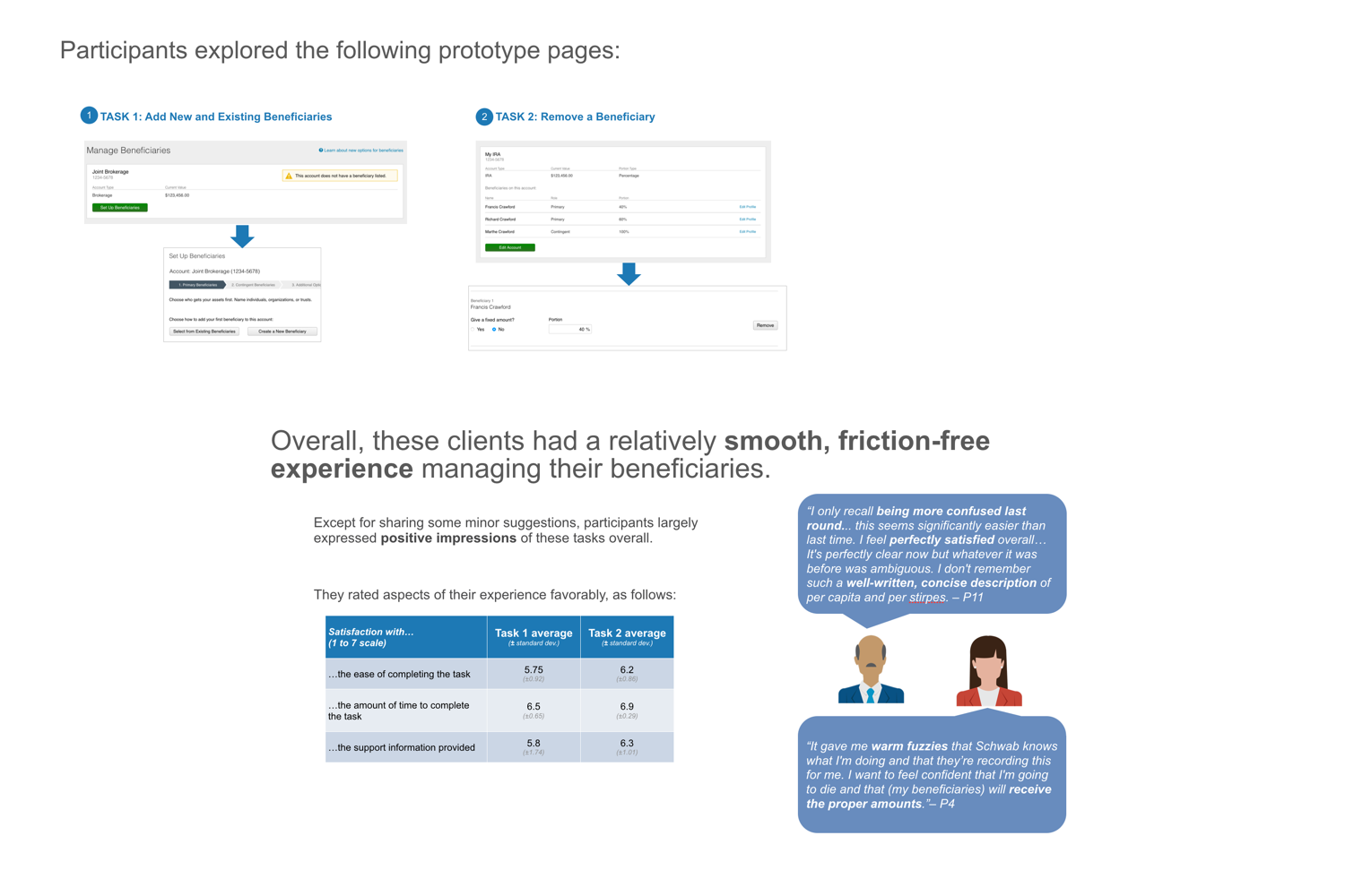
I iterated several times on the tables for the page as well, testing them with users to find out which columns of data were most important for them, and which could be hidden behind a click in the smaller sidebar. Schwab used a third-party contracting company for research, but I was heavily involved and responsible for creating the designs and prototypes being used in the tests, along with defining the goals of the test with the researcher.
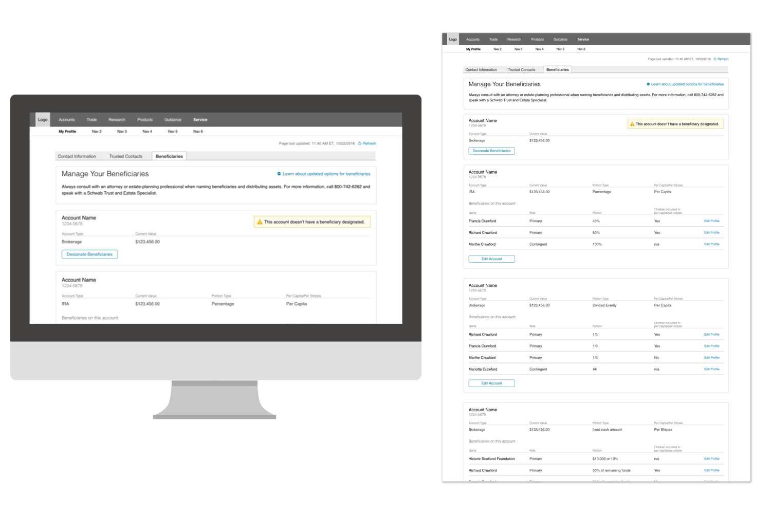
Beneficiaries
Problem
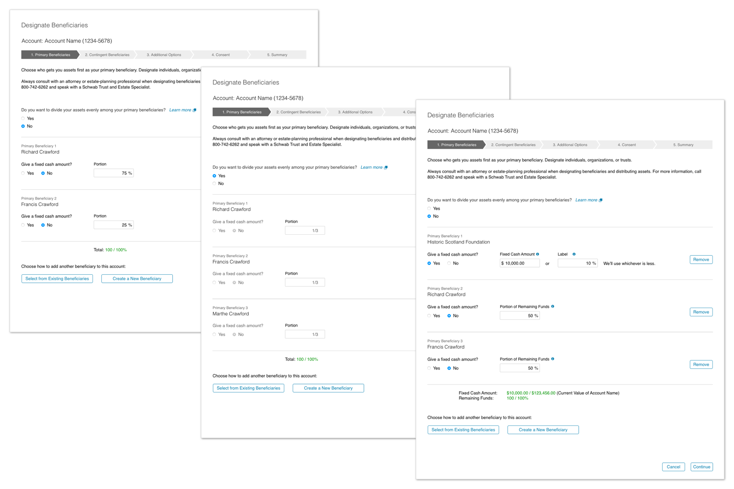
The current Schwab website only allowed users to enter a percentage when it came to how much to leave to their beneficiaries, and research found that clients were using a paper form to submit other configurations that they wanted to used. Schwab’s estate team would then have to honor whatever had been written in the margins of that paperwork when a client passed away.
Research
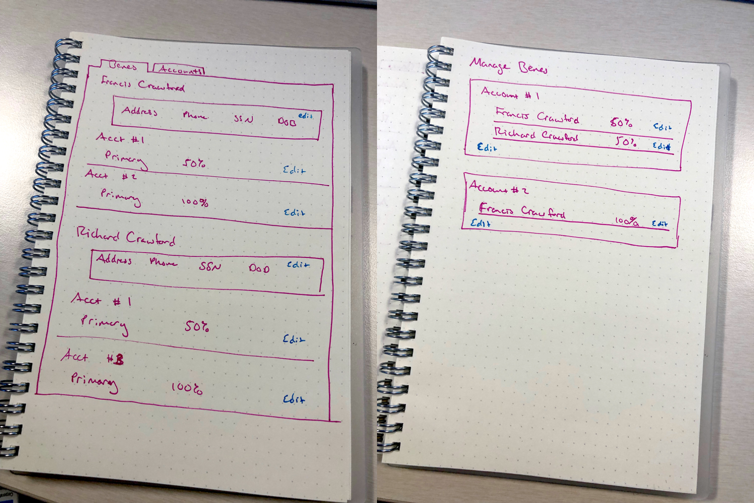
I was brought on as the lead designer at the beginning of the project. The main goal was to create a summary page that solved the problem of how users accessed their beneficiaries on the website today, and the second goal was a completely new form that was easy to use and added several new features. I went through several rounds of design and testing before landing on a design that fit in with the rest of the Service section of Schwab.com, and felt like a natural extension of the My Profile section (previously, Beneficiaries had been under Account Settings, but testing showed us that users expected it to be part of their profile settings instead.)
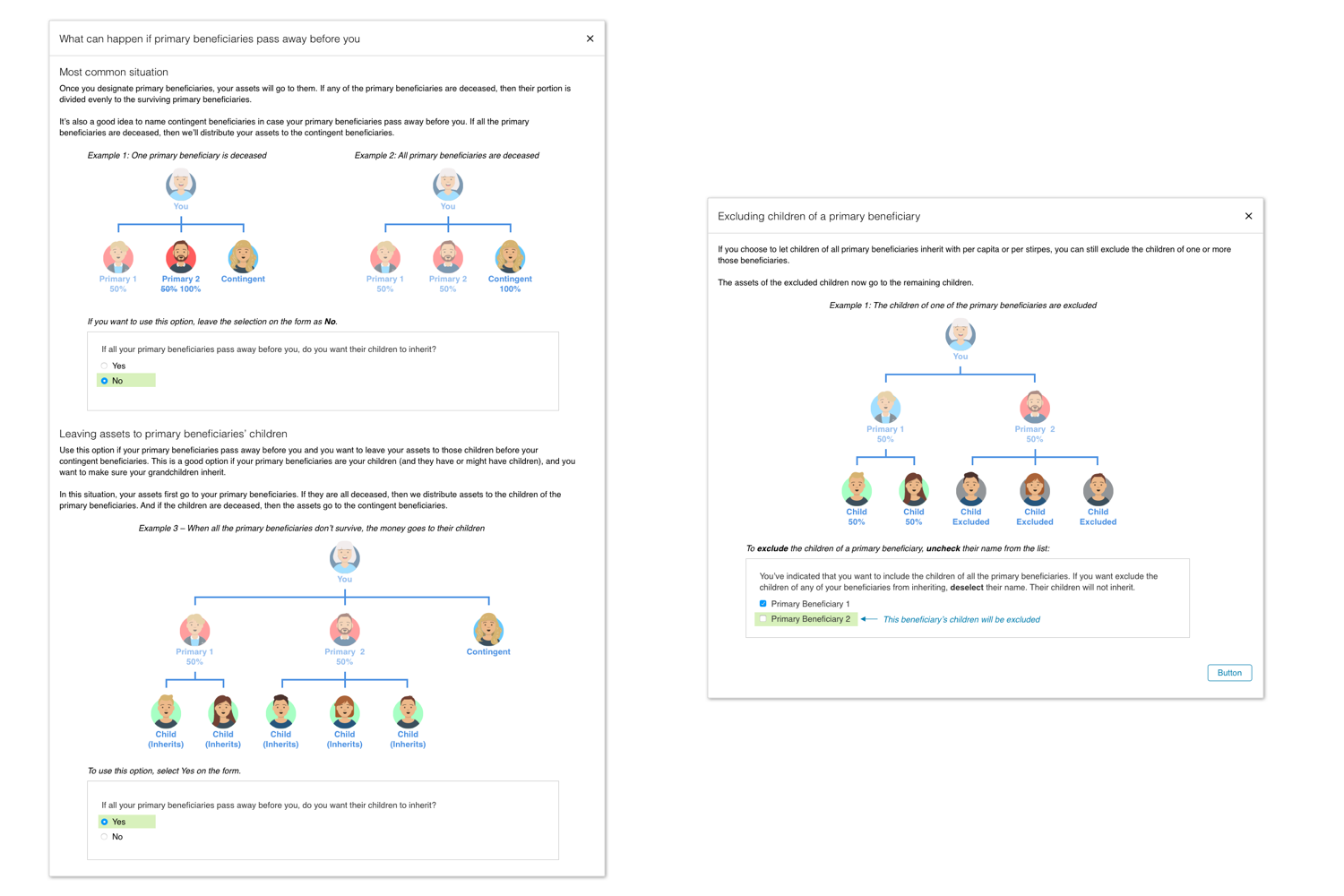
I spent a large amount of time on this project researching how estate law is actually handled – I worked together with Schwab’s estate team, product owners, and with call center reps to better understand the impact of the choices being made on the form and the most common questions that users had. This enabled me to order and phrase the questions in simple and meaningful ways that users were able to understand without needed a lot of outside education. (I also designed some concept work for educational overlays that explained complicated concepts like per capita and per stirpes using illustrations.) One of our testers claimed the form was so easy to understand his 8-year-old daughter could fill it out, which is my favorite feedback from a user testing session to date!
Outcome
By streamlining the most common requests in an easy to use online form, we reduced the need for paper forms and made the process of setting up beneficiaries much easier for our users. Providing well-written and illustrated educational materials made the complicated legal concepts easy to understand and helped users feel confident about the decisions they were making.